Wednesday, April 28, 2010

Beastly Good

Beasts of Burden showcases the kind of episodic-yet-continuous storytelling that, in my humble opinion, is too-often missing from modern comics. Each of these four issues is a done-in-one tale that is more rewarding if you read the issue before and after it. Changes in characters flow from one issue to the next, but there is nothing that can’t be referenced or explained briefly in the next issue without feeling awkward and expository. Whereas as most comics today rely on expansive, decompressed narratives that feature entire issues where very little happens to progress the story, it is such a treat to read an issue and feel that you have gotten a complete story. JMS is using a similar formula on his current run on The Brave and the Bold for DC Comics, but his stories have been pushed into questionable continuity so as not to conflict with any of the long, drawn-out plots DC has been banking on for quite some time.

Beasts also has pedigree going for it. Written by (somewhat) famous indie comic creator Evan Dorkin (whose Milk and Cheese dug into my consciousness at a young age thanks to its frequent appearance on the television show Roseanne in the background), Beasts shows a maturity and confidence in its storytelling. It almost shocked me to see Beasts nominated for an Eisner for “Best Publication for Teens,” not because it isn’t worthy, but because it hardly feels like it’s toned down for a younger audience. I know I was certainly saddened and stunned when the end of the first issue came and the eaten animal comrades didn’t emerge unscathed from the frog’s stomach.
Dorkin also writes to his artist’s strengths. In Jill Thompson’s case, the strengths are many. One of the few creators to be handed the keys to the kingdom of The Endless of Sandman fame with Neil’s blessing, Thompson’s work leaps across genres from quirky-but-traditional (her series work in Sandman) to manga (Death: At Death’s Door), to children-appropriate (Scary Godmother) to painterly (here, obviously). Thanks to her long and varied career, Thompson’s watercolor work doesn’t feel stiff and posed like so many other paint-based comics illustrators. Instead, her palette breathes and comes to vivid life. I would go so far as to say that Thompson is one of the only comics painters whose work I look forward to with glee and not dread.

My own journey with Beasts came after seeing an advertisement in a Star Wars comic (also published by Dark Horse) and biting for the animal-based premise. After I took a gamble on these four issues, I eagerly sought out the compilations that previous Beasts stories appeared in, paying a bit extra to get those that are out of print. Dark Horse graciously offered all but one for free online, but I needed these bound and on my shelf. I sincerely hope that the free offers drag more people to explore Burden Hill and discover a perfect use of monthly comics outside of the regular mainstream hullabaloo. I know I'm in for more.

A Trip Through Dream Country


The most curious thing about Neil Gaiman's Sandman opus is that it really is as good as it's made out to be. With an army of artists at his side, Gaiman crafted what is, in my humble opinion, easily one of the top 5 comics stories ever told. By utterly revamping the idea of the The Sandman into a grand, myth-spanning being known as Dream or Morpheus, Gaiman opened up a gateway to storytelling without limits. That is precisely what is on display here in the third volume, Dream Country.

Rather than suggest we read the first volume (which was more of a horror comic teetering as it found its footing) or a later volume (which would require more context than time allowed), I latched onto Dream Country as the perfect example of what made The Sandman the seminal series it was. Collected in this slim trade are four stories that intermingle horror, comedy, fantasy, despair, and outstanding creativity. Most of all, they barely feature the titular character (except for the last tale, which doesn't feature him at all). I suspect that this method of storytelling will be familiar to those class members who read more than a handful of Spirit stories. Like Eisner and his masked do-gooder, the greatest strength of Morpheus might lie in his creator's boundless drive to tell stories.

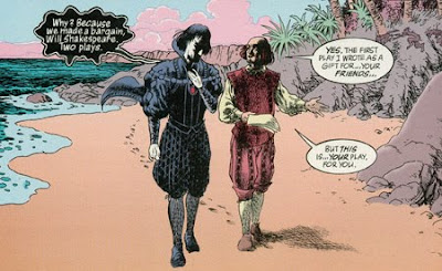
The four seemingly disparate tales in this volume all revolve around the idea of dreams. These dreams require captured stimulus ("Calliope"), are the basis for powerful change ("A Dream of a Thousand Cats"), are granted in a bargain ("A Midsummer Night's Dream"), or seem unattainable and mournful ("Façade"). In any situation, dreams are the center of the Sandman mythos, so the title to this volume is exceedingly appropriate.


The first two tales, pencilled by Kelley Jones, show the range that this series is willing to take. In "Calliope," we are privy to a wicked deal to spark a novelist's creativity. This entry perhaps ties the most into the regular fabric of the series, as the Furies and Orpheus both factor in. This story also serves as a sort of hub of metaphors, as Dream's own bondage is mirrored here by the captured muse, and the tortured writer's bargain is a much darker version of the deal that Will Shakespeare will make in a few issues' time. "A Dream of a Thousand Cats" is an issue that tends to stick in the minds of many Sandman readers. I think this is the first (but not the last, no, certainly not the last) issue of The Sandman that made me cry when I first read it years ago. The sadness of the unnamed cat's tale really struck me because it didn't feel forced in any way, and she was such an audacious, powerful female character -- who is also a cat. Here Dream is a dark cat with brilliant eyes, and the issue doesn't feel like a "What If?" but like truth, a quality that was felt in the best of the 75 issues.


"A Midsummer Night's Dream" has the distinction of being the only comic to ever win the World Fantasy Award (not without controversy), and I can certainly see how it earned the prize. By framing itself around and within the famous play of the same name, Gaiman and collaborator Charles Vess get a lot of mileage out of a conventional size comic book. This story is one of those perfect mixtures of comedy and sadness that Gaiman is so adept at, with Robin Goodfellow and the rest of the faerie causing mischief even as Will Shakespeare's young son illustrates his skewed priorities. The end of the story, with its twisted lift from Shakespeare, gets me every time and inspired much of my love for the original play.


Finally, this volume includes "Façade," a story that I suspect readers won't respond to as well as the preceding three. I know that I hardly cared for Gaiman's collaboration with Colleen Doran the first time I read it, but my feelings have changed with time. This melancholy tale of a forgotten Silver Age heroine shows Gaiman's ability to mature a character without going overboard. Rainie becomes more complex and real in these 22 pages than she ever did in her myriad adventures before, even if the story is a heartbreaking one. It also doesn't even feature Morpheus, though the real breakout star of the series drops by at the end. yes, Death is probably the most affecting character to be spawned in Gaiman's epic run. The idea of Death as a spry young goth girl changed everything when she was introduced and provided the genesis for some of the strongest stories Gaiman has ever told. While Death certainly has one of the single greatest lines in all of comicdom (I won't spoil it here), I'll be damned if her greeting on the telephone at the end of this issue doesn't bring the tears right back up.


And I suppose that's one of the most honest things I can say about the quality of The Sandman. I laugh and I cry every time I work my way through a story, no matter how many times I have read it before. I'm so grateful that Gaiman was able to bring this book to the public at a time when overly rendered, grotesquely muscled murderers ruled the comics scene. As comics were striving to become "mature" by virtue of more guns, more blood, and more sex (not to mention more pouches), Gaiman and crew were effortlessly putting the foundation into place for true mature storytelling. Vertigo wouldn't exist in nearly the same form it currently does if Sandman had never been published, and the world would be much worse for it. Luckily, enough of us still dream about the characters that Gaiman and his team of artists created to keep them around.

Thursday, April 22, 2010

"Nice One, Scott! Now Turn The Page!"

Scott Pilgrim is a precious little story.
I came across the first volume in the series a few years ago after reading about it in Wizard and online. Initially, I wanted to see what the hype was all about. After years of disliking manga, I wasn't excited to jump into a series created in a similar format, and the volume ended up drifting onto a bookshelf, awaiting its time to be read. Sure enough, after about a year, I finally got around to opening the cover and jumping in.

The funny thing is, I just don't have all that much to say about this first volume because I feel like it's all so obvious. Bryan Lee O'Malley poured all of his geekiness and angst into this series, and it really reads like a passion product from a creator who can still edit himself (not to discredit any work that the fine folks at Oni Comics might have put into the editing process). Sure, O'Malley throws reference after reference at the reader and introduces world-building elements without much warning, but Scott Pilgrim succeeds where so many fan-service projects go wrong: there is a heart and soul to the story beyond the nerdiness.


The characterization displays this best. Scott is a lovable loser/slacker, but O'Malley puts him in situations that deepen his character. The awkwardness of dating a high schooler, the feeling of mediocrity with Sex Bob-omb, his... unique living situation, the dreams of a mysterious courier, and his night with Ramona all affect Scott in ways that lift him above a two-diminesional stereotype for a nerdy guy in his position in life. Wallace is another great example, as O'Malley plays some stereotypes up in a realistic way (teasing and flirting with "straight" characters) while showing Wallace's responsibility for and tolerance of Scott as well as his troublesome drinking habits. Aside from the alcoholism, I can attest that the relationship between Wallace and Scott is strikingly similar to the relationship I share with some of my close friends from home. The key to these characterizations is that O'Malley knows how to have some fun with it all, balancing character maturity with lighthearted moments and plenty of absurdly unreal additions.

Think about it: is there any warning that Scott's dreams will be revealed to be a subspace portal, or that Matthew Patel will attack Scott with magical powers and summon demon hipster chicks? Up until the first instance, Scott Pilgrim could just be a winsome slice-of-life story for a Canadian slacker who likes to make video game references. But thanks to O'Malley's manic manga-inspired art style, these twists of absurdity just feel natural. I had an issue with Death Note because the supernatural elements felt too inorganic and much too easily accepted, but I would point toward Scott Pilgrim as an example of throwing in crazy plot elements without much explanation and having it all make sense. The art is a little rougher here than in later volumes (to be expected), but it's full of energy even when it seems to be cutting corners, and O'Malley never skimps on the action.

With the impending Edgar Wright-helmed movie adaptation starring good 'ole non-actor Michael Cera, it's a great time to be a Scott Pilgrim fan. I mean, even a few years ago, volumes were hard to come by because of small print runs. I'm pretty sure the movie will be pretty good, but Michael Cera will just play Michael Cera like he always does, so prime reading season is anytime from now until August when you'll be unable to un-hear Michael Cera's voice every time you read any of Scott Pilgrim's dialogue. Get in before it's ruined, kids!

Thursday, April 8, 2010

"Light" on Appeal -- For Me, Anyway

I last read a manga in eighth grade, if memory serves me right. When the manga book happened a decade ago, I got right onboard, but I ultimately couldn't buy into the differences in storytelling between Japanese (and sometimes Korean) tales and the American books I grew up with. I'm never sure if the difference is in translation or the culture itself, but some things never click with me, but I'll get to that in a little bit.

First, some context that shows how fundamentally different manga really is from American comics. Firstly, manga is a huge, if declining, business in Japan. Since Japan is a commuter culture, the need for quick entertainment is strong. To put it into perspective, the sales for manga on cell phones alone trumped the sales for comics in America last year. This is partially because there are manga aimed at young children all the way through to stay-at-home moms, but another large reason for this is the disposable format and cheapness of manga. Manga magazines, such as Weekly Shonen Jump (where Death Note first appeared in serialized format), are usually the sizes of phone books, feature only a few ad pages, and are printed on very cheap paper. They come out weekly and tend to cost the equivalent of US $4.00. American comics, on the other hand, ship monthly on nice paper and cost between $2.99 and $3.99 (sometimes more) for 22 pages of story content with 10 pages of ads. Manga readers are frequently polled about what stories they enjoy and features are swapped in and out accordingly, with the popular ones being collected into bound volumes that sell for more money.

Because of the weekly printing schedule, most mangaka (manga creators) are aided by a team of uncredited assistants, many of whom are apprentice mangaka. In many cases, the well known artist lays out panels and draws figures, and little else. Someone else is in charge of backgrounds, lettering, inking, etc. This is not wholly dissimilar to American comics; big name artists provide the pencils, and workhorse creators come in to ink, color, and letter over those pencils. The biggest difference is that those inkers and colorists and letterers are always credited in today's world, and have been for quite some time. The notion of having uncredited artists providing backgrounds or figure work would get an American creator excised by fans and publishers, and assists from other artists are almost always done on different pages and credited as such. As a reader and a hopeful creator, I find the idea of uncredited work distasteful and insulting to the people putting in the long hours to insure the book comes out on time, but this is ingrained in the manga industry. In this book, I found the art capable, but nothing extraordinary. I enjoyed the Shinigami designs, but their world was so muddled in shadow that I was left wanting. In some cases, the backgrounds seemed to be computer-filtered photographs or tracing work, which did nothing to win me over.

With all of that aside, Death Note still wasn't for me. Shonen is manga aimed at teen boys, a category that I don't quite fit into. While I read many slam-bang superhero books, the titles that I tend to enjoy most have heavy character moments, serious drama, well-explored concepts, and sufficient build-up. I am intrigued by Death Note's central premise, and I enjoy Ryuk as a character and as a cool visual, but there is much too little story development for me. I can't fault the series necessarily; if it moved at the pace I would have enjoyed, it surely would have bored the teen readers and been cancelled long before it finished. Within one chapter, Light finds a death note, meets a god of death, and starts his massive quest to rid the world of evil and rule over his utopia. I just can't get into a story that takes place in the "real world" where a teen boy is more brilliant than the entire police force and unfazed by meeting a GOD OF DEATH. The introduction of L. as a young man who inexplicably gets free reign over global task forces only made matters worse. The suspension of disbelief fell through, but it might have worked much better for me when I was a lot younger.

I don't mean any of this as an insult to the format, as I still believe that I will find manga that I enjoy regardless of production or publishing differences. I enjoyed Death Note for what it is, but that magical manga that clicks with me probably won't be shonen.

Thursday, April 1, 2010

"..."

Shaun Tan's The Arrival is a beautiful, beautiful thing.


For someone with so little connection to immigration -- my family has lived in the country for generations on all sides and have virtually no idea where they originated from -- The Arrival perfectly replicated the feeling of being in an alien place and trying to make a home for yourself and, potentially, your family. That Tan chose to communicate this wordlessly, mostly removing the language that plays such an essential role in feeling out of place, is even more impressive. Tan creates his own vocabulary of symbols and letters, allowing for the book to be completely universal, as long as you can see pictures.

Tan's expansive cities, built like the mash-up of clock cogs and Aztec pyramids, abstract paintings and hieroglyphics, feel wondrous and intimidating. The host of statues whose meanings are never explained draw up echos of foreign landmarks that visitors will never comprehend. Food is confusing and strange, a feeling you can replicate by entering many of the restaurants in the Village. Even the method of obtaining the food is alien; I recall being with a group of friends in a Japanese restaurant as the waiter explained how to eat the food, not simply what it was that they were eating. The delightful animal companions feel particularly relevant to me. I had friends who recently returned from Turkey and they observed that stray dogs and cats were neutered, tagged, given food and shelter, played with -- but not kept as pets. The idea that someone would keep an animal as a companion was illogical, even though those animals were respected. Similarly, I'm always astounded by how tourists react to squirrels. We take the little creatures for granted, as they live in such a large part of our nation and are so friendly here in NYC, but many foreign tourists have never seen squirrels, or at least never so close. The relationship citizens have with pot-inhabiting animals in the novel is not one we're comfortable with (would you befriend any animal that might live in a small space in your house?), but it becomes familiar during the story.

The "heavier" aspects of the story also have a beautiful sense of economy to them, particularly the protagonist's sadly comical search for a job and the dark back stories to several of his fellow immigrants. Whether it is a dark "dragon" that floats above the city or massive vacuuming gasmen or a aimless march to war, the conflicts ring true without evoking a single historical instance. Of course, this is The Arrival's brilliance: this is not an immigrant's tale, but The Immigrant's Tale.

From a technical standpoint, Tan's artwork is strong, but unconventional. On a "traditional" comic, his meticulous pencil work and photograph-quality figure work would look overly static and posed in almost every case, but for a story that evokes the photographic quality of memories, snapshots, and moments, it is perfect. The sheer amount of skill needed to tell a coherent story in pictures alone is unbelievable. Browse any comic news site and take a look at the inked, unlettered pages of mainstream books. Even the masters of mainstream sequential storytelling cannot tell stories alone. You may understand the groundwork and pace of the story, but I defy you to imagine what the character is saying or thinking behind the grins and grimaces, or even what kind of time is passing from panel to panel. Tan slows scenes down a beat, showing movement on a much closer micro-level so that the flow from panel to panel is never lost. Alternatively, he chooses single images that capture moments perfectly and do not require time to convey emotion and narrative.


It's a shame that many readers would flip through The Arrival hastily, moving past the beautiful storytelling in each panel in search of text or flashy action. When I gave someone Asterios Polyp, a similarly monumental graphic novel that relies heavily on images, color, and design to tell its tale, I was astonished that it took him only about twenty minutes to finish its several hundred pages. I expressed disbelief that he actually read it. "I read every word," he said. He might technically be right, but I am sure he missed thousands of "words" in every image. The Arrival has millions.