Sunday, May 2, 2010
Reading the first collection of G. Willow Wilson and M.K. Perker's Air is a bit like reading letters from another country: everything is a bit off, it's difficult to understand and follow, but it's all very enticing and you want to know more. Air follows an acrophobic flight attendant swept up in an international (supernational?) conspiracy to... Well, I'm not entirely too sure what the conspiracy really is at this point. I know it involves a forgotten kingdom called Narimar, an ethnically shifting paramour, the shadowy Etesian Front, a winged serpent, a fuel-free engine, some mentions of dominatrixes, marigolds, reality-bending flying machines, and Amelia Earhart. And that's all in the first five issues. Sound like a lot? It is.
I read this first volume of Air in three chunks with short breaks in between. After just finishing it, I'm a little confused about what became of the angry female Front member and the priest, and I can't recall if we found out who the pilot of the "flying palace" actually is quite yet. If I were attempting to follow this series with a month lapse between each issue, I'm not sure I would have the will to continue. I applaud Wilson for keeping things moving and introducing a lot in a small amount of time without feeling horribly rushed, but these sorts of Vertigo books benefit from more of a slow build. As comic readers, we can accept some extraordinary circumstances, but I wish Wilson had gotten more milage out of defining how odd this world is to its regular inhabitants. Blythe and her colleagues seem entirely too ready to adapt to every crazy thing that happens along the way, and it lowers the impact of the zanier elements for me as a reader. I have no concept of what life was like before the zaniness set it, so everything has less of an impact on me. I could see how Blythe's reactions would be more open, but Fletcher or Mrs. B could have really filled that role to help contextualize Air's world and strengthen character at the same time. Ultimately, I find the elements of Air very interesting, but I am having trouble finding my window into the world.
The art, provided by the Turkish M.K. Perker, is solid but I didn't personally feel it was exceptional. As pointed out by a review quoted on the Wikipedia page for Air, his work is very reminiscent of an early Brandon Peterson. I'm a fan of Peterson's hyper-detailed, heavily cross-hatched work, but Perker's is less meticulous and occasionally inconsistent. Faces tend to distort, and detail rapidly disappears as the panel pans outward. I feel that Air suffers from an unfortunate case of having an artist who provides vastly more interesting cover work than interior work. While I appreciate great cover work, I would never condemn a book for its cover. But when you look at how many other Vertigo books invite very expressive artists to provide beautiful covers for books with dissimilar interior artists, you find that the gap is wide enough to judge each separately. For Air, Perker's covers are colored in a much finer manner than his interiors, which helps to distract from his figure work shortcomings. Even with that complaint aside, his choice of framing often felt just a little stilted and unoriginal. You don't have to redefine the rules every time you pick up a pencil, but the panel staging could be a little more dynamic. I felt like he hit his stride more confidently when the more visually appealing airships came in at the end of this volume, but it felt like too little, too late for me.
As it stands, Air seems overly eager to get its interesting ideas across without suitably setting up its fictional world. My interests are piqued by the last page reveal, but they're not $9.99 piqued, so I likely will not be flying Clearfleet Airlines again anytime soon.
Wednesday, April 28, 2010
Beastly Good
Beasts of Burden showcases the kind of episodic-yet-continuous storytelling that, in my humble opinion, is too-often missing from modern comics. Each of these four issues is a done-in-one tale that is more rewarding if you read the issue before and after it. Changes in characters flow from one issue to the next, but there is nothing that can’t be referenced or explained briefly in the next issue without feeling awkward and expository. Whereas as most comics today rely on expansive, decompressed narratives that feature entire issues where very little happens to progress the story, it is such a treat to read an issue and feel that you have gotten a complete story. JMS is using a similar formula on his current run on The Brave and the Bold for DC Comics, but his stories have been pushed into questionable continuity so as not to conflict with any of the long, drawn-out plots DC has been banking on for quite some time.
Beasts also has pedigree going for it. Written by (somewhat) famous indie comic creator Evan Dorkin (whose Milk and Cheese dug into my consciousness at a young age thanks to its frequent appearance on the television show Roseanne in the background), Beasts shows a maturity and confidence in its storytelling. It almost shocked me to see Beasts nominated for an Eisner for “Best Publication for Teens,” not because it isn’t worthy, but because it hardly feels like it’s toned down for a younger audience. I know I was certainly saddened and stunned when the end of the first issue came and the eaten animal comrades didn’t emerge unscathed from the frog’s stomach.
Dorkin also writes to his artist’s strengths. In Jill Thompson’s case, the strengths are many. One of the few creators to be handed the keys to the kingdom of The Endless of Sandman fame with Neil’s blessing, Thompson’s work leaps across genres from quirky-but-traditional (her series work in Sandman) to manga (Death: At Death’s Door), to children-appropriate (Scary Godmother) to painterly (here, obviously). Thanks to her long and varied career, Thompson’s watercolor work doesn’t feel stiff and posed like so many other paint-based comics illustrators. Instead, her palette breathes and comes to vivid life. I would go so far as to say that Thompson is one of the only comics painters whose work I look forward to with glee and not dread.
My own journey with Beasts came after seeing an advertisement in a Star Wars comic (also published by Dark Horse) and biting for the animal-based premise. After I took a gamble on these four issues, I eagerly sought out the compilations that previous Beasts stories appeared in, paying a bit extra to get those that are out of print. Dark Horse graciously offered all but one for free online, but I needed these bound and on my shelf. I sincerely hope that the free offers drag more people to explore Burden Hill and discover a perfect use of monthly comics outside of the regular mainstream hullabaloo. I know I'm in for more.
A Trip Through Dream Country
The most curious thing about Neil Gaiman's Sandman opus is that it really is as good as it's made out to be. With an army of artists at his side, Gaiman crafted what is, in my humble opinion, easily one of the top 5 comics stories ever told. By utterly revamping the idea of the The Sandman into a grand, myth-spanning being known as Dream or Morpheus, Gaiman opened up a gateway to storytelling without limits. That is precisely what is on display here in the third volume, Dream Country.
Rather than suggest we read the first volume (which was more of a horror comic teetering as it found its footing) or a later volume (which would require more context than time allowed), I latched onto Dream Country as the perfect example of what made The Sandman the seminal series it was. Collected in this slim trade are four stories that intermingle horror, comedy, fantasy, despair, and outstanding creativity. Most of all, they barely feature the titular character (except for the last tale, which doesn't feature him at all). I suspect that this method of storytelling will be familiar to those class members who read more than a handful of Spirit stories. Like Eisner and his masked do-gooder, the greatest strength of Morpheus might lie in his creator's boundless drive to tell stories.
The four seemingly disparate tales in this volume all revolve around the idea of dreams. These dreams require captured stimulus ("Calliope"), are the basis for powerful change ("A Dream of a Thousand Cats"), are granted in a bargain ("A Midsummer Night's Dream"), or seem unattainable and mournful ("Façade"). In any situation, dreams are the center of the Sandman mythos, so the title to this volume is exceedingly appropriate.
The first two tales, pencilled by Kelley Jones, show the range that this series is willing to take. In "Calliope," we are privy to a wicked deal to spark a novelist's creativity. This entry perhaps ties the most into the regular fabric of the series, as the Furies and Orpheus both factor in. This story also serves as a sort of hub of metaphors, as Dream's own bondage is mirrored here by the captured muse, and the tortured writer's bargain is a much darker version of the deal that Will Shakespeare will make in a few issues' time. "A Dream of a Thousand Cats" is an issue that tends to stick in the minds of many Sandman readers. I think this is the first (but not the last, no, certainly not the last) issue of The Sandman that made me cry when I first read it years ago. The sadness of the unnamed cat's tale really struck me because it didn't feel forced in any way, and she was such an audacious, powerful female character -- who is also a cat. Here Dream is a dark cat with brilliant eyes, and the issue doesn't feel like a "What If?" but like truth, a quality that was felt in the best of the 75 issues.
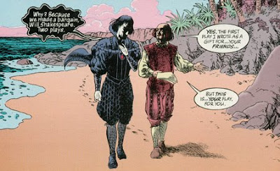
"A Midsummer Night's Dream" has the distinction of being the only comic to ever win the World Fantasy Award (not without controversy), and I can certainly see how it earned the prize. By framing itself around and within the famous play of the same name, Gaiman and collaborator Charles Vess get a lot of mileage out of a conventional size comic book. This story is one of those perfect mixtures of comedy and sadness that Gaiman is so adept at, with Robin Goodfellow and the rest of the faerie causing mischief even as Will Shakespeare's young son illustrates his skewed priorities. The end of the story, with its twisted lift from Shakespeare, gets me every time and inspired much of my love for the original play.
Finally, this volume includes "Façade," a story that I suspect readers won't respond to as well as the preceding three. I know that I hardly cared for Gaiman's collaboration with Colleen Doran the first time I read it, but my feelings have changed with time. This melancholy tale of a forgotten Silver Age heroine shows Gaiman's ability to mature a character without going overboard. Rainie becomes more complex and real in these 22 pages than she ever did in her myriad adventures before, even if the story is a heartbreaking one. It also doesn't even feature Morpheus, though the real breakout star of the series drops by at the end. yes, Death is probably the most affecting character to be spawned in Gaiman's epic run. The idea of Death as a spry young goth girl changed everything when she was introduced and provided the genesis for some of the strongest stories Gaiman has ever told. While Death certainly has one of the single greatest lines in all of comicdom (I won't spoil it here), I'll be damned if her greeting on the telephone at the end of this issue doesn't bring the tears right back up.
And I suppose that's one of the most honest things I can say about the quality of The Sandman. I laugh and I cry every time I work my way through a story, no matter how many times I have read it before. I'm so grateful that Gaiman was able to bring this book to the public at a time when overly rendered, grotesquely muscled murderers ruled the comics scene. As comics were striving to become "mature" by virtue of more guns, more blood, and more sex (not to mention more pouches), Gaiman and crew were effortlessly putting the foundation into place for true mature storytelling. Vertigo wouldn't exist in nearly the same form it currently does if Sandman had never been published, and the world would be much worse for it. Luckily, enough of us still dream about the characters that Gaiman and his team of artists created to keep them around.
Thursday, April 22, 2010
"Nice One, Scott! Now Turn The Page!"
Scott Pilgrim is a precious little story.
I came across the first volume in the series a few years ago after reading about it in Wizard and online. Initially, I wanted to see what the hype was all about. After years of disliking manga, I wasn't excited to jump into a series created in a similar format, and the volume ended up drifting onto a bookshelf, awaiting its time to be read. Sure enough, after about a year, I finally got around to opening the cover and jumping in.
The funny thing is, I just don't have all that much to say about this first volume because I feel like it's all so obvious. Bryan Lee O'Malley poured all of his geekiness and angst into this series, and it really reads like a passion product from a creator who can still edit himself (not to discredit any work that the fine folks at Oni Comics might have put into the editing process). Sure, O'Malley throws reference after reference at the reader and introduces world-building elements without much warning, but Scott Pilgrim succeeds where so many fan-service projects go wrong: there is a heart and soul to the story beyond the nerdiness.
The characterization displays this best. Scott is a lovable loser/slacker, but O'Malley puts him in situations that deepen his character. The awkwardness of dating a high schooler, the feeling of mediocrity with Sex Bob-omb, his... unique living situation, the dreams of a mysterious courier, and his night with Ramona all affect Scott in ways that lift him above a two-diminesional stereotype for a nerdy guy in his position in life. Wallace is another great example, as O'Malley plays some stereotypes up in a realistic way (teasing and flirting with "straight" characters) while showing Wallace's responsibility for and tolerance of Scott as well as his troublesome drinking habits. Aside from the alcoholism, I can attest that the relationship between Wallace and Scott is strikingly similar to the relationship I share with some of my close friends from home. The key to these characterizations is that O'Malley knows how to have some fun with it all, balancing character maturity with lighthearted moments and plenty of absurdly unreal additions.
Think about it: is there any warning that Scott's dreams will be revealed to be a subspace portal, or that Matthew Patel will attack Scott with magical powers and summon demon hipster chicks? Up until the first instance, Scott Pilgrim could just be a winsome slice-of-life story for a Canadian slacker who likes to make video game references. But thanks to O'Malley's manic manga-inspired art style, these twists of absurdity just feel natural. I had an issue with Death Note because the supernatural elements felt too inorganic and much too easily accepted, but I would point toward Scott Pilgrim as an example of throwing in crazy plot elements without much explanation and having it all make sense. The art is a little rougher here than in later volumes (to be expected), but it's full of energy even when it seems to be cutting corners, and O'Malley never skimps on the action.
With the impending Edgar Wright-helmed movie adaptation starring good 'ole non-actor Michael Cera, it's a great time to be a Scott Pilgrim fan. I mean, even a few years ago, volumes were hard to come by because of small print runs. I'm pretty sure the movie will be pretty good, but Michael Cera will just play Michael Cera like he always does, so prime reading season is anytime from now until August when you'll be unable to un-hear Michael Cera's voice every time you read any of Scott Pilgrim's dialogue. Get in before it's ruined, kids!
Thursday, April 8, 2010
"Light" on Appeal -- For Me, Anyway
I last read a manga in eighth grade, if memory serves me right. When the manga book happened a decade ago, I got right onboard, but I ultimately couldn't buy into the differences in storytelling between Japanese (and sometimes Korean) tales and the American books I grew up with. I'm never sure if the difference is in translation or the culture itself, but some things never click with me, but I'll get to that in a little bit.
First, some context that shows how fundamentally different manga really is from American comics. Firstly, manga is a huge, if declining, business in Japan. Since Japan is a commuter culture, the need for quick entertainment is strong. To put it into perspective, the sales for manga on cell phones alone trumped the sales for comics in America last year. This is partially because there are manga aimed at young children all the way through to stay-at-home moms, but another large reason for this is the disposable format and cheapness of manga. Manga magazines, such as Weekly Shonen Jump (where Death Note first appeared in serialized format), are usually the sizes of phone books, feature only a few ad pages, and are printed on very cheap paper. They come out weekly and tend to cost the equivalent of US $4.00. American comics, on the other hand, ship monthly on nice paper and cost between $2.99 and $3.99 (sometimes more) for 22 pages of story content with 10 pages of ads. Manga readers are frequently polled about what stories they enjoy and features are swapped in and out accordingly, with the popular ones being collected into bound volumes that sell for more money.
Because of the weekly printing schedule, most mangaka (manga creators) are aided by a team of uncredited assistants, many of whom are apprentice mangaka. In many cases, the well known artist lays out panels and draws figures, and little else. Someone else is in charge of backgrounds, lettering, inking, etc. This is not wholly dissimilar to American comics; big name artists provide the pencils, and workhorse creators come in to ink, color, and letter over those pencils. The biggest difference is that those inkers and colorists and letterers are always credited in today's world, and have been for quite some time. The notion of having uncredited artists providing backgrounds or figure work would get an American creator excised by fans and publishers, and assists from other artists are almost always done on different pages and credited as such. As a reader and a hopeful creator, I find the idea of uncredited work distasteful and insulting to the people putting in the long hours to insure the book comes out on time, but this is ingrained in the manga industry. In this book, I found the art capable, but nothing extraordinary. I enjoyed the Shinigami designs, but their world was so muddled in shadow that I was left wanting. In some cases, the backgrounds seemed to be computer-filtered photographs or tracing work, which did nothing to win me over.
With all of that aside, Death Note still wasn't for me. Shonen is manga aimed at teen boys, a category that I don't quite fit into. While I read many slam-bang superhero books, the titles that I tend to enjoy most have heavy character moments, serious drama, well-explored concepts, and sufficient build-up. I am intrigued by Death Note's central premise, and I enjoy Ryuk as a character and as a cool visual, but there is much too little story development for me. I can't fault the series necessarily; if it moved at the pace I would have enjoyed, it surely would have bored the teen readers and been cancelled long before it finished. Within one chapter, Light finds a death note, meets a god of death, and starts his massive quest to rid the world of evil and rule over his utopia. I just can't get into a story that takes place in the "real world" where a teen boy is more brilliant than the entire police force and unfazed by meeting a GOD OF DEATH. The introduction of L. as a young man who inexplicably gets free reign over global task forces only made matters worse. The suspension of disbelief fell through, but it might have worked much better for me when I was a lot younger.
I don't mean any of this as an insult to the format, as I still believe that I will find manga that I enjoy regardless of production or publishing differences. I enjoyed Death Note for what it is, but that magical manga that clicks with me probably won't be shonen.
Thursday, April 1, 2010
"..."
Shaun Tan's The Arrival is a beautiful, beautiful thing.
For someone with so little connection to immigration -- my family has lived in the country for generations on all sides and have virtually no idea where they originated from -- The Arrival perfectly replicated the feeling of being in an alien place and trying to make a home for yourself and, potentially, your family. That Tan chose to communicate this wordlessly, mostly removing the language that plays such an essential role in feeling out of place, is even more impressive. Tan creates his own vocabulary of symbols and letters, allowing for the book to be completely universal, as long as you can see pictures.
Tan's expansive cities, built like the mash-up of clock cogs and Aztec pyramids, abstract paintings and hieroglyphics, feel wondrous and intimidating. The host of statues whose meanings are never explained draw up echos of foreign landmarks that visitors will never comprehend. Food is confusing and strange, a feeling you can replicate by entering many of the restaurants in the Village. Even the method of obtaining the food is alien; I recall being with a group of friends in a Japanese restaurant as the waiter explained how to eat the food, not simply what it was that they were eating. The delightful animal companions feel particularly relevant to me. I had friends who recently returned from Turkey and they observed that stray dogs and cats were neutered, tagged, given food and shelter, played with -- but not kept as pets. The idea that someone would keep an animal as a companion was illogical, even though those animals were respected. Similarly, I'm always astounded by how tourists react to squirrels. We take the little creatures for granted, as they live in such a large part of our nation and are so friendly here in NYC, but many foreign tourists have never seen squirrels, or at least never so close. The relationship citizens have with pot-inhabiting animals in the novel is not one we're comfortable with (would you befriend any animal that might live in a small space in your house?), but it becomes familiar during the story.
The "heavier" aspects of the story also have a beautiful sense of economy to them, particularly the protagonist's sadly comical search for a job and the dark back stories to several of his fellow immigrants. Whether it is a dark "dragon" that floats above the city or massive vacuuming gasmen or a aimless march to war, the conflicts ring true without evoking a single historical instance. Of course, this is The Arrival's brilliance: this is not an immigrant's tale, but The Immigrant's Tale.
From a technical standpoint, Tan's artwork is strong, but unconventional. On a "traditional" comic, his meticulous pencil work and photograph-quality figure work would look overly static and posed in almost every case, but for a story that evokes the photographic quality of memories, snapshots, and moments, it is perfect. The sheer amount of skill needed to tell a coherent story in pictures alone is unbelievable. Browse any comic news site and take a look at the inked, unlettered pages of mainstream books. Even the masters of mainstream sequential storytelling cannot tell stories alone. You may understand the groundwork and pace of the story, but I defy you to imagine what the character is saying or thinking behind the grins and grimaces, or even what kind of time is passing from panel to panel. Tan slows scenes down a beat, showing movement on a much closer micro-level so that the flow from panel to panel is never lost. Alternatively, he chooses single images that capture moments perfectly and do not require time to convey emotion and narrative.
It's a shame that many readers would flip through The Arrival hastily, moving past the beautiful storytelling in each panel in search of text or flashy action. When I gave someone Asterios Polyp, a similarly monumental graphic novel that relies heavily on images, color, and design to tell its tale, I was astonished that it took him only about twenty minutes to finish its several hundred pages. I expressed disbelief that he actually read it. "I read every word," he said. He might technically be right, but I am sure he missed thousands of "words" in every image. The Arrival has millions.
Thursday, March 25, 2010
EPIC
Wow.
Where do I start?
Bone is epic -- in every sense of the word. I'm a little ashamed that it has taken me so long to get around to reading it. After all, I've owned the stupid rat creature toy since I was ten or eleven. I remember looking at the back of the packaging and being disappointed that the other figures in the lines, with the exception of the menacing deluxe Kingdok that I could never find in stores, were so... cartoony. At that time in my life, I was happy to accept cartoons, and I was thrilled to discover high fantasy, but I couldn't accept a merging of the two. Years later, as my tastes evolved and diversified, the massive tome found itself on my short list of books to read. When it was assigned, and I was eager to dive in, but waited until break to do so. Unfortunately, reading Jeff Smith's follow-up, RASL, put a big damper on my excitement. I wondered if Bone would similarly have an awkward beginning, an unstable meld of genres, or iffy anatomy.
Thankfully, I was wrong. From the first issue, Bone displays a sense of consistency and confidence. Of course the artwork matures with time, but the storytelling strength is apparent immediately. Really, the amount of excellent choices that seem effortless is just astounding. Similarly to Scott McCloud's Zot!, each of the Bone brothers is relatively one note, creating an instant relatability but not denying the option for character growth. The Bones are drawn relatively sexless, but still male, allowing boys to connect and girls to find them adorable. Rose is a strong female character, keeping girls even more engaged. Fone Bone, while very much a hero on his own right, is not the story's "chosen" figure, keeping him relatable to the reader even as the mythic parts of the script build up. The world's mythology is well constructed, but avoids being either explicitly Judeo-Christian or pagan, focusing instead on a cultural blend of dragons, one of the most omni-present of legendary beasts. The villainous rat creatures are humanized by way of the two stupid, stupid members of their species, and Barnaby, but Smith postpones much of the inherent sentimentality to insure that the race is still downright scary when he needs them to be. Bearing in mind that Smith has been drawing tales of these little white creatures since childhood, it is truly estimable how well he constructed Bone's basic elements.
Speaking of childhood, Bone is pretty impeccably suited for readers of any age. Bearing in mind that Bone was first published over the course of a decade, the narrative content grew and changed with the reader. While the first three volumes contain almost nothing questionable (beyond Smiley's cigar-chompin' and Phoney's sexual innuendo, both removed from a version published in Disney Adventures), later volumes carry heavy emotional weight. Beloved characters die or are placed in threatening situations. Several scenes are straight out horrific: Briar's appearances, especially when her bisection is revealed; the head guard's dragon-scarred visage; and Rose's final confrontation with Kingdok, where the mad rat king boasts of eating her mother as she still lived and begs to be killed. This material is dark, and the consequences dire. Smith's masterful pacing and build up prepares readers to face this, and his rarely-absent humor alleviates the mood without seeming out of place. And, while I'm not sure how much this device resulted from intention or from a delayed publishing schedule, each and every issue offers a recap of what came before, expertly hidden in dialogue during the opening pages, keeping kids on track and reminded of what they're reading. With a volume so intimidatingly large as Bone, such a helping hand keeps discouraged readers reading on.
While it may not be apparent, it's commendable just how little Smith plays around with form here. With his great love of cartooning and classic comic strips, Smith's panel layouts tend to be very standard, and his angles didn't vary greatly. He made great use of silent panels, as well as panels that involved only slight changes from the previous panel, creating nuance and subtlety in a medium not necessarily known for either. The single bit of tinkering Smith did with comics form that comes to mind is the dialogue balloons of the Hooded One. Instead of having a standard tail that ends approximately halfway between the balloon and the speaker's mouth, the Hooded One's balloon tails slink down and into the hood, constantly teasing at her true identity and adding an air of creepiness to her appearances. In most cases, Smith had no need to mess around with format; his goal, as stated, was to create a comic book epic on par with the Odyssey or Moby Dick, not to reinvent the wheel. He absolutely succeeded.
As for John Canemaker's article about Bone's impending film adaptation? Well, I can confidently say that I'm not interested in the least, but I won't condemn the project. Comics have a fraught history of film adaptation, and discussions of such invariably end up insulting me a bit. I was shocked and saddended to see Jeff Smith say "comics are storyboard." How can such a living legend discredit his medium like that? For the same reasons that I very rarely use the term "graphic novel," I cringe whenever I hear comic books compared to storyboards, or treated like a facet of film development instead of a medium of its own. In my mind, Bone's greatest triumph is crucially linked to its medium. Jeff Smith set out to create a comic epic, not a pitch for a film. Lord of the Rings got lucky with its film adaptations, but there is a reason that Herman Melville's novel Moby Dick hasn't been eclipsed by a definitive film version. The point of reading it is reading it. On top of my stubborness, the news that Smith is not involved in the writing process and that the art will be computer generated as opposed to a style that might capture some of Smith's talent sours the idea even further. Seeing a film version can't ruin my idea of Bone, but I might elect not to taint it at all if and when the film ever debuts.
Thursday, March 11, 2010
AGGGHHHHH
I have to say that, out of all of the Comic Book League's "Astonishing New York Fantasy" selections, my favorite was the one-page short comic starring James Franco by D.B. Costales. Now, it's not completely original; a similar, less NYU-specific scene unfolded with Margot Kidder in an episode of Family Guy (which I could only find in German, but I'm pretty sure it's even better that way), but it's fun, short, and effective. The art perfectly complements the insanity, and, moreover, it's consistent. I'm not going to insult the work of any student artist, but many of the stories fall short because of inconsistent or messy figure work, panel borders, and lettering. Costales sidesteps these issues by doing everything by hand with a suitably dark pen, taking cares to erase or avoid stray marks.
I found a lot of Taimur Dar and Connie Kim's short parodies to be amusing too, and I like the (uncredited?) "pin-ups" in the back of the volume. I'd be lying if I said that I didn't get a kick out of the opening tale by Andrew Choi and Costales (whose work shows less polish here) thanks to its animal protagonists, but I would have liked to have seen it hand-lettered and a little clearer with its central concept.
All in all, some good fun is present in this "double-sized" spectacular, all for the low, low price of free.
Million Dollar Baby
Detective Comics #27 is monumentally important, but that doesn't mean it has aged well. The cover promises the "amazing and unique" adventures of "The Bat-Man," but there is little unique here, as the caped crusader just kind of follows Commissioner Gordon around as the police track a series of murders. He has all of four lines while in costume, including one where he brushes off the horrific, acid bath death of a criminal like it's no big thing. There have certainly been many narrative changes since 1939, but we've read other material from the era (namely, The Spirit) that really uses the medium to the fullest. Detective Comics really uses the art to illustrate a sparse prose story, allowing the visuals to carry almost none of the story alone. I'm extremely appreciative that this character did catch on and open up the doors to some of the greatest stories ever told, but here I see so little of what has given Batman (no hyphen!) his lasting appeal.
The succinct origin story fares better, if only because it allows the art some room to breathe. The bombastic narration and odd follow-up (nice chemistry set, Bruce) clash with the dark happenings in the story, but that's simply how the medium was used back then. Even now, we have trouble balancing between fun and darkness (see: the nineties). It's interesting that this "origin" doesn't cross into his costumed career until the last panel. It's almost as if the creators wanted to give him a motive but not explain too much, allowing his adventures to seem somewhat timeless and free of constrained continuity. This stands in sharp contrast with Batman: Year One, and it seems almost anachronistic considering how light comics became for decades following the story's publication.
It is the first appearance of the Joker that lights up this trifecta of stories. With the addition of an equally odd antagonist, Batman begins to feel like a distinct and needed character. The ghastly visage of the Joker lends the story all the darkness it needs to counteract the engorged narration. Sure, Batman makes quips about "Leap Year" and there is nary a panel that is without narration or dialogue, but this story finally feels like it would fit better in the comics medium than in a pulp magazine. Of course, we read a Shadow story that might have influenced this character, but influences mean little as long as the final product is good. And what better way to represent the duality at play in these early comics -- the tragic hero in the flamboyant costume, the multiple deaths witnessed by an acrobatic youngster -- than a murderous clown? It's been said that the Joker was originally slated to be killed off after his first appearance. We should all be grateful he got another shot.
Context Rox
R.C. Harvey's examination of "Lorelie Rox" illumines (no pun intended) details of the story that we discussed in class, with the added benefit of some context, but he doesn't break much new ground. It doesn't take an extremely insightful reader to notice what an important role lighting plays in the opening pages of this story, but it helps to know Eisner's impetus for pushing the medium as much as he did. It's hard not to respect the man more for returning from war and still feeling that humor serves an important role in storytelling, for having the drive to present "fables, modern morality dramas [...] the supernatural, the inexplicable [...] science fiction [...] music [...] and poetry," all under one banner. It's not a shame that he left his monumental creation to push the medium in different directions, only that more creators couldn't learn from his work. Even the most progressive writers since Eisner -- Moore, Ellis, Morrison -- don't always maintain the narrative clarity that Eisner kept hold of throughout his experimental works. Maybe they should try a stint in the army.
Thursday, March 4, 2010
Love, Hate, and then there's RASL
Jeff Smith had an almost impossible task ahead of him. How does a self-publishing legend, a critical darling, and a beloved all-ages creator begin work on a new project?
Well, evidently by going for a dark atmosphere over substance and shipping once every three or four months.
Allow me to clarify: I didn't dislike RASL, but I didn't particularly like it either. It's not a bad comic by any stretch of the imagination, but I wouldn't label it excellent unless you're obliged to worship anything Smith puts out. I'm going to start with the bad, since I am a pessimist.
Three over-sized issues in, I don't understand the seemingly-central plot device. The "Drift" has not only been under-explained, but under-depicted. I struggled to make sense of the oblong shape in the sea of black ink that shows up when the titular character makes a trip through the Drift. I'm a firm believer that science-fiction needs to be handled in a variation of two ways: either the story revolves around an excellent science-based idea and plot, or you must explain away the science to focus on the story at hand. RASL doesn't really commit to either. Smith wants to tease us with small hints of the science at hand, including some clunky explanatory scenes in the third issue, but he has yet to do more than add strange element after strange element. On the flip-side, his character plots have remained almost completely intertwined with the sci-fi elements, making it difficult to connect to characters due to gaps in understanding about the way RASL's universe operates. The Native American plot and the art thief angles could be welcome, fresh elements in this sci-fi tale, but Smith hasn't made much of either yet.
Additionally, it can come across that Smith is just trying too hard not to be "the Bone guy." Carrying a "suitable for mature audiences" warning, Smith tries to darken RASL in clunky ways that don't contribute to the narrative, such as the exposed breasts of the prostitute(?) that RASL sleeps with and his strip club visit. I'm not sure that either added to my understanding of RASL, but these sort of elements might work well if not for Smith's inability to sufficiently depart from his Bone art style. While no creator should be forced to write just one type of story, the medium of comics calls for different visual styles to suit different storytelling tones. Writers have free range to work with the most suitable artists, but artists and cartoonists need to be able to adapt to different moods visually. The vagabond that RASL meets in the third issue looks ripped right from the world of Bone, to humorous effect. The eponymous character, however, spends much of his time looking like a "Yu-Gi-Oh" character with the fullest hair a woman could ever hope for. There are also scenes where his anatomy is downright bad (I defy you to explain away RASL's pose and figure on page 17 of the collected volume in any rational manner). Much of the issue stems from inconsistency; the RASL of pages 29 and 53 is not the same wasp-waisted RASL of page 38, let alone the freakishly long-armed RASL of the opening sequence.
Consistency also comes into play when you consider the slow-boil plot. Mainstream comics are in an age of decompressed storytelling, where plots and events drag out over months. This kind of slow pacing might be considered expertly done if the book had a regular shipping schedule, but publishing six issues in two years doesn't qualify the book as possessing such. I have the benefit of reading a collected volume (and I have a sneaking suspicion that the glowing major publication reviewers quoted on the back cover did as well), but I can guarantee that I would have called it quits with this title after the first hiatus. Even this collected volume feels like a Hail Mary to keep interest alive in some form, as it certainly doesn't include a full story arc of any sort.
Now Sour Steve is going to exit the blogosphere for a moment so that Sunny Steve can write a few positive notes.
RASL succeeds in several ways. As a book with an unusually large page size, RASL has the challenge of justifying its unique format. Here, Smith does a good job by allowing for wide, open panel designs. RASL is so sparsely populated by characters that the expansive panel deisgn helps to make the feeling more intentional. The desert of the first few pages wouldn't work as well if it weren't so blindingly white and open, and scenes like pg. 19's explosion benefit from the space alloted.
RASL is billed as a "sci-fi noir," and Smith makes occasional use of the noir aspect to great benefit, laying on heavy inks as on the image from pg. 18 that was swapped for the cover, or the first meeting with the lizard-like assassin pages later. Scenes like the latter also benefit from Smith's restraint with dialogue. The book features little narration, focusing instead on allowing the action to speak for itself. Often very kinetic, the layouts are never difficult to follow. I'm disappointed that this focus seems to disolve as the book goes on (compare the first struggle with the lizard man to the last), but Smith might very well strike a balance in future issues.
At the end of the day, RASL offers something very different, both from Smith's previous output and from the majority of books published each month. Its unhurried pace, intriguing (if inconsistent) visual style, striking use of black and white, and decently fresh science fiction devices, RASL might very well be looked back on fondly. Perhaps I'm just not the target audience, as I didn't grow up with the self-publishing boom and its resulting storytelling styles. The most grevious error, in my mind, is the inability to ship the product in a manner that complements the plot's decompression. This volume didn't offer me enough to want to stick around for the years it might take for the series to payoff, but I certainly think more committed fans will find aspects to enjoy.
Thursday, February 25, 2010
ORIGIN-al
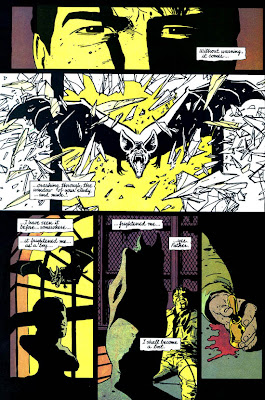
There are many tropes at work in superhero comics: reboots, retcons, crises, time travel, and origin stories, to name a few. Many of these blend together, and all run the risk of raising the ire of finicky fans who secretly fear any change in characters they knew as children. That's why the stunning commercial and critical success of Batman: Year One is so impressive. Frank Miller, who would go on to produce several truly awful Batman stories in his life (really, just plain atrocious), provides a definitive, grounded origin of the Bat in four issues and says more about Bruce Wayne and his world than many Batwriters do in years.
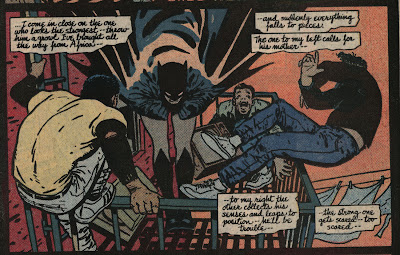
The essential quality at work here is the realism. DC has long made its claim to fame with iconic heroes who often seem larger than life. Somehow, despite having a world populated with aliens, Amazons, and ring-slingers, a highly trained, highly analytical, borderline obsessive vigilante is one of their most popular characters. Miller latches onto this and removes any ludicrous elements from his tale, showing Bruce Wayne in his earliest, roughest days, sweat suits and all. When the chances of a mystical or cosmological deus ex machina are removed, the consequences feel more real to the reader. We can believe that Batman might take punches and feel pain because we know he has never shot a God in the chest. We feel that corrupt cops present a viable threat because no anthropomorphic crocodiles are terrorizing the city.
Perhaps more importantly, Miller chooses to contextualize Batman in ways that are often pushed to the side in favor of more ridiculous fare. Gotham City works well as a setting because it isn't a real place, allowing artists to get a bit more creative and symbolic. In the hands of many creators, Gotham becomes a stereotypical "dark city," but in the hands of Miller's genius collaborative partner David Mazzucchelli, Gotham is Chicago, Detroit, New York, and something else entirely rolled up in one. The slums and tenements feel like they belong in a real city instead of a movie set.
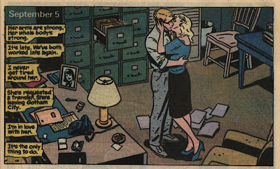
The inhabitants of the city are given renewed purpose as well. Undeniably Miller's best choice, setting up James Gordon as a direct parallel to Batman keeps the origin story from becoming repetitive or indulgent. His rise and fall is an essential sense of perspective for readers seeing a masked man jumping between rooftops. Adding the element of Gordon's affair with Detective Essen gives him what every hero needs: a flaw, and a chance for redemption. This is particularly impressive when you take into account that Miller's tale is set years before countless other Batman stories, seemingly forbidding Miller from advancing the characters in any significant way beyond what we already know.
Then there is the matter of what is known, namely the rogues. While much of Year One's success rests with its realism, removing too many aspects of the character makes one beg the question, why use the character at all? The new "Human Target" television series on FOX is "based" on a comic book, but its central premise is gone. The movie version of Wanted shared about 5 minutes of similarities with the comic, so why was it even called "Wanted"? Miller's most recent Batman work, All-Star Batman & Robin, the Boy Wonder, is pretty much a Sin City story featuring characters in Batman costumes, and his proposed Batman/ Al-Qaeda match-up really shouldn't even be discussed.
Thankfully, we see enough of what we know here to avoid falling into this trap. While Miller's casting of Selina Kyle as a prostitute was retconned (probably for the best), she does have a healthy role in the series, foreshadowing her romantic tango with Bats years later. Harvey Dent's tragic downfall starts within these pages, lending extra gravity to the relationship he has with Bruce. Of course, no one could forget the deliciously tantalizing final lines of the series, finally followed up on in 2005 and ripped directly from the page for the closing scene in the film Batman Begins. All of these elements combine to show us that we really are seeing the gestation of a fictional world, one that is a few steps outside of our own but not so far off that we can't comprehend its workings.
Of course, Year One left a lasting legacy at DC. Although (re: Thank God) the non-Miller/Mazzucchelli Year Two was stricken from continuity, very little from this tale has been contradicted. A host of other DC characters have recieved the "Year One" treatment, including the Bat-family's own Batgirl (excellent), Nightwing, Robin, and Huntress; Green Arrow (fantastic artwork by Jock); Metamorpho (thumbs down); Teen Titans (fun and inconsequential); the big guns, JLA; and Black Lightning (surprisingly good -- and needed). Joe Casey, long-time writer for the Big Two and smaller companies, recently said that he would do away with all of the frequent "tags" we assign to comics, including "Year One," but it can't be denied that fans like to be filled in on the gaps in time of their favorite characters (seriously, though, who thought Metamorpho needed this?). If they were all as successful as Batman: Year One, then I say bring them on.
Jones. Desolation Jones.
The elements of Warren Ellis' script for Desolation Jones #1 that are most apparent are trust and respect. Ellis trusts J.H. Williams III enough to move quickly through his descriptions, leaving much of the interpretation open to Williams III. I have read Ellis' scripts for other artists and I can attest that he writes to suit the level of artistic experience he is working with. Williams III has worked with Howard Chaykin, Greg Rucka, Grant Morrison, and even Alan Moore -- he hardly needs to be coddled.
Ellis obviously has a very distinct version of our world in mind throughout this story, yet he leaves so many visual cues up to Williams III to decide. A more controlling writer would spend pages agonizing over the details of the world he has imagined in his head, but Ellis acknowledges that this comic is a collaboration. He takes time to lay out plot-specific details, such as the titular character's key visual traits, settings that impact the story, and background props that come into play, but he trusts Williams III to figure out how to bend perspective, have a road melt into a map, and design tools for the hunt of living steak. If Ellis envisions a panel where a character's profile mirrors that of an x-ray, he includes the description; if he needs a character to seem a bit paranoid and troubled, he knows that Williams III can depict that without much guidance.
I'm sure, however, that Ellis' scripts were not always like this. His writing style now speaks with a confident voice, that of a scripter who knows his artist's capabilities and focuses instead on dialogue and plotting. When he first began working for 2000 AD with a host of talented but unseasoned artists, I am sure he overwrote a bit to make sure that his ideas were carried across. Did he ever hit Mooresque heights of script detail and control? I'm not sure, but I am glad that he has been able to hone his craft down to its most essential parts. Not only is he going to increase his own effeciency, he is going to constantly challenge and improve the quality of his artists. Especially when he is writing about Hitler porn.
Wednesday, February 17, 2010
Q. When is a Main Character Not a Main Character?
A. When the creators are nervous about working with icons.
Of course, who am I to talk? No one has ever plopped a legendary character in my lap and said, "go for it." From a young age, however, I have been crafting my own stories with characters that hold iconic status the world over. Whether it was with action figures in hand, on my mother's old typewriter, or in script programs on a Macbook, I have always tried to understand the unique nature of characters that pass from creator to creator. As I've studied this in practice, a certain "tell" has become noticeable. Many creators, even big, bankable names, have been known to take on classic characters in eponymous books and tell stories that focus on anything but the classic character.
A good perennial example of this is the Vertigo title Hellblazer. The long-running book was first written by Jamie Delano and is now a consistent low-seller, but the book hasn't neared cancellation because it's a good venue to test out new writers at such a small imprint. While the main character may be John Constantine (no resemblance to the awful movie iteration), he is often little more than a lens into whatever fantastic situations or antagonists writers come up with. John Constantine, instead of being a long-established character, is really a cipher.
But enough of 'ole John. Denny Colt has his fair share of time out of the spotlight to deal with. Let us look at the sixth issue of Darwyn Cooke's run, in which the Spirit appears in only a few pages as he listens to the story that he largely missed. I enjoyed the issue, and I felt that the writing and the art were both strong, but there was nothing dictating that it be a Spirit story. Any detective or good-doer could have been substituted in with no ill effect.
Looking at Cooke's collaboration with Jeph Loeb, (in)famously hot and cold writer, we can see a similar, but not identical case unfolding. In this Eisner-award winning one-shot, which sparked enough interest to garner a Spirit ongoing written and drawn by Cooke, Loeb plays heavily on the similarities between the Batman and the Spirit to create a feasible (in comic book sense) reason for the characters to meet. As Batman and the Spirit both have close connections to police commissioners and colorful rogues galleries, the story centers around a grand team-up of the rogues to crash a police ball that brings the crime-busting forces of Gotham and Central City to one place. Though it is an oversized issue, Loeb spends the majority of the time fleshing out the characters of Commissioners Gordon and Dolan and planting the seeds of deception and seduction with Catwoman (a character that Cooke helped to redesign and reinvent) and P'gell (one of the many sultry women to cross the Spirit's path). Batman is nearly wordless throughout much of his appearance (as is completely in character) and the Spirit doesn't have much of a character at all, beyond being a bit less intelligent and a bit more eager than Bats. Cooke's art, complemented by the inkwork of J. Bone and the colors of Dave Stewart, harkens back to the period from which the Spirit emerged without being drenched in noir trappings. The story is fun and no gross mischaracterization is perpetuated, but at the end of the day, the titular characters are secondary to the supporting cast.
Loeb is always either a whiz at cutting right to the core of characters (see: Batman: The Long Halloween, Superman: For All Seasons, the "color" books) or a fiend for taking a massive dump on any previous characterization at the extreme disservice of the finished product (see: anything under the Ultimate banner, the first 12 or so issues of Hulk). Here he walks a fine line between servicing the legacy and actually adding to the mythos. Is that all we can hope for? Even Alan Moore and Neil Gaiman, when they tackled the character for a series published by Kitchen Sink Press entitled The Spirit: New Adventures, wrote the hell out of every character except for the damn Spirit! Moore's contribution, drawn by his Watchmen collaborator Dave Gibbons, retells the Spirit's origin -- by telling the origin of three ancillary characters involved. Gaiman's focuses on a sadsack writer who happens to accidentally help the Spirit out on a case. Both stories are beautifully written, feature wonderful art and some of the most inventive titles I have ever seen (Gibbons spells using breakfast items), but they were little more than love notes that were afraid to sully what came before by adding something readers might not agree with. While Will Eisner classically used the character as a vessel to tell stories about many colorful secondary characters with some very poignant notes, he did so without sacrificing actual characterization of the hero. The only other real attempt I have seen at deepening Denny is Frank Miller's movie, and nothing about that could be deemed a success (notice how I never say anything nice about comic book movies?).
As the Spirit prepares to be reintroduced by Brian Azzerello and Rags Morales in the pages of DC's New Wave, he'll also receive his own title written by Prince Valiant news strip scripter Mark Shultz. That (admittedly underwhelming) news, however, was dulled when Shultz spoke to Jeff Renaud at CBR and let it be known that he would depart the title after only three issues, citing too much on his plate. Is he also concerned about the weight of writing such a renowned character? Possibly not, as he made it known that the trademark humor of the series would take a backseat to darker tales featuring the character, a sign that comic fans have learned to fear. Then again, I have to wonder how many fans the Spirit even has. With half a century since his debut, long periods out of the limelight, whole generations of fans that know nothing about him, an awful movie adaptation, several false starts, and a seeming lack of characterization, what fan base is the Spirit holding onto, and how long will it last?
Subscribe to:
Posts (Atom)